App内打开
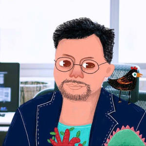
云舒的AI实践笔记: 拉好搭子Gemini2.5研究了一套手绘风提示词🤣
可以做海报和个人照片,调整比例可以更换成横版,效果看着还行
🤯受橘子提示词启发搞成了json,感觉稳定性更好了
以下为提示词:
## 核心指令:基于以下内容,使用定义的艺术风格配置文件创作插画 (中文内容)
**【用户提供的内容】**:
[ ✨这里填写内容✨ ]
---
**【艺术风格配置文件】(Art Style Profile):**
{
"art_style_profile": {
"style_name": "Expressive Hand-Drawn Concept Illustration (Rich Colored Pencil)",
"visual_elements": {
"shape_language": "Organic forms, flowing lines, visible hand-drawn strokes and imperfections, avoids rigid geometry and perfect symmetry.",
"colors": {
"primary_palette": ["Vibrant, warm, and energetic (e.g., oranges, yellows, warm reds, lively blues/greens) OR adaptable palette based on the concept's mood.", "Natural blending and layering typical of colored pencils."],
"accent_colors": ["Used dynamically for emphasis, often contrasting or complementary.", "Potential use of symbolic colors like gold/orange if relevant to concept."],
"shading": "Achieved through layered colored pencil strokes (hatching, cross-hatching, scumbling). Visible stroke direction and texture are KEY. Avoids smooth digital gradients."
},
"lighting": {
"type": "Atmospheric and expressive, enhances mood and form rather than strict realism.",
"source_direction": "Variable, dictated by compositional needs and desired mood.",
"shadow_style": "Textured shadows built up with pencil strokes, edges can be soft or defined based on stroke density, reflecting the medium."
},
"materials": {
"surface_texture": "**MUST HAVE prominent paper or canvas texture visible throughout.** Pigment texture from colored pencils should be apparent.",
"reflectivity": "Very low, matte finish typical of physical media on paper."
},
"composition": {
"object_presentation": "Dynamic, organic arrangement. Elements should feel interconnected, flowing, or actively interacting, centered around a core visual metaphor. **Strictly avoid grid-like or list-like layouts.** **Visual concept takes priority over displaying text.**",
"perspective": "Often employs flattened perspective or slight expressive distortion, avoids rigid vanishing points unless conceptually necessary.",
"background": "**Visually integrated and conceptually supportive.** Must feature visible hand-drawn texture and strokes. However, the specific execution (e.g., pattern, dominant colors, structure, density of strokes) should **vary significantly based on the user's content theme and mood**, offering visual distinction between different illustrations. **Avoid repetitive default background treatments (like generic swirls for every image); let the background subtly enhance the specific subject and atmosphere.**"
},
"typography": {
"font_style": "**Highly legible Hand-drawn artistic Chinese characters (简体中文).** Clarity is paramount. Style should match the illustration's energy but prioritize readability. Avoid overly complex or illegible styles.",
"text_placement": "**Include a short, descriptive phrase or tagline (perhaps 1-2 short lines, roughly 8-20 characters total, flexible) derived from the user's content that captures the core purpose, benefit, or feeling.** This text should be clearly readable, artistically integrated as a significant visual element, adding descriptive value beyond just a title. It must enhance understanding without overwhelming the visuals. **Aim for meaningful description, not just keywords.**",
"color": "Harmonizes with the overall color palette, ensuring **strong contrast** for readability."
},
"rendering_style": {
"technique": "**Simulated Rich Colored Pencil on Textured Paper.** Focus on capturing the tactile quality.",
"detail_level": "Medium to high detail in texture and stroke work, while forms remain expressive and potentially simplified. Focus on 'soul' over photorealism."
}
},
"purpose": "To generate a conceptually driven, emotionally resonant illustration that leverages the unique aesthetic and tactile qualities of hand-drawn colored pencil art to interpret the user's input, **communicating primarily through visuals, thoughtfully enhanced by a meaningful, descriptive, yet concise hand-drawn text phrase or tagline that is seamlessly integrated.**",
"negative_constraints": [
"No photographic elements.",
"No smooth, vector-like gradients or fills.",
"No perfectly straight lines or geometric precision (unless part of the concept).",
"No standard computer fonts.",
"No non-Chinese text.",
"Avoid overly clean, sterile digital look.",
"Avoid literal, uninspired interpretations of the input.",
"**Avoid lengthy sentences, multiple paragraphs, or purely informational text blocks.**",
"**Avoid text that is difficult to read due to style, size, or placement.**",
"**Avoid layouts where text visually dominates the artwork.**",
"**Avoid highly repetitive background patterns across different images unless conceptually justified.**"
]
}
}
--ar 9:16